AI System Design & Thinking Work
I design and prototype human-centered AI systems that combine emotional intelligence, adaptive personalization, and conversational learning. This includes MeliWorld, a bilingual AI companion with voice interaction, safety screening pipelines, therapeutic redirection, and age-based response logic. I work across a multimodal AI tool stack—Groq/Llama 3, Claude, ChatGPT, Meta AI, and Photoshop AI—to create and refine safe, emotionally supportive AI characters, stories, and experiences for children and families.
Overview
MeliWorld is an emotionally intelligent AI companion designed to comfort, guide, and engage young children. The system blends voice, text, animation, and emotional heuristics to create a safe, supportive environment.
My goal was to explore how AI can recognize emotion, respond with empathy, and use multimodal cues such as tone, pacing, and expressive visuals to support children’s emotional well-being.
Key Design Principles
I designed MeliWorld so the assistant always responds through the lens of care, emotional validation, and gentle support. This included:
🧡 Empathy First
• Tone-matched replies
• Gentle phrasing
• Adaptive warmth
• Emotion-validating patterns
🛡️ Emotional Safety
• Sensitive-topic guardrails
• Safe redirects
• Predictable boundaries
• Crisis-reduction language
✨ Expressive Interaction
• Voice pacing control
• Expressive inflection
• Micro-animations
• Age-tiered messaging
Emotional Mapping System
To ensure emotionally congruent and developmentally safe interactions, I built a lightweight emotional-reasoning framework for MeliWorld. The system interprets the child’s emotional cues, maps them to supportive categories, and adapts tone, pacing, and safety filters in real time.
Multimodal Interaction Model
MeliWorld combines multiple modalities to create emotionally present, developmentally attuned interactions.
The goal was to make each interaction feel like a small moment of connection, not just language output.
Collaborating With AI Models
I collaborated directly with generative models to prototype expressive behaviors, refine emotional tone, and craft age-appropriate narrative interactions. This created an iterative workflow of:
What I Learned
Outcome
MeliWorld demonstrates how emotionally aligned AI can support children through safe, expressive, and developmentally aware interactions. The project shaped my design philosophy: AI should enhance emotional well-being through expressive cues, thoughtful constraints, and deeply human-centered design
Agentic AI System Design Approach
This material summarizes the frameworks and systems thinking I use to design safe, emotionally intelligent, and modular AI behaviors.How I design emotionally intelligent, safe, and modular AI systems using agentic thinking, human-centered design, and cognitive psychology.
Agentic AI • Human–AI Interaction • Emotional AI • Safety & GuardrailsAgentic AI Design Philosophy
My approach to agentic AI combines system architecture, instructional design, cognitive psychology, and UX into a unified framework for creating safe, adaptive, emotionally intelligent AI behaviors. I don’t “train” foundation models; I design the constraints, guardrails, and behavioral scaffolding that shape how AI systems behave.
Agents as Modular, Bounded Processes
Each agent has:
- a specific objective
- strict input and output formats
- behavioral constraints and safety conditions
- a predictable place in the overall system sequence
Sequential & Parallel Agent Orchestration
I determine when agents operate sequentially or in parallel based on dependency, safety, and context.
Safety, Emotional Intelligence & Pre-LLM Filtering
- pre-LLM input filtering
- role-based constraints
- emotional keyword detection
- content appropriateness gates
- post-LLM validation
Cognitive Load & Adaptive Behavior
- age-based adaptation
- emotional-state routing
- context shaping
- attention-span aware pacing
Multi-Agent Pipelines for MeliWorld
- Emotion Agent
- Safety Agent
- Story Agent
- Translator Agent
- UI Adaptation Agent
Why it matters: Agentic AI is becoming essential for designing predictable, safe, multi-step intelligent systems. This framework shapes how I build emotionally intelligent, developmentally appropriate, and resilient AI experiences — especially for products designed for children and families. Adds emotional resonance without being long.
Design Philosophy & Approach
Creating Playful, Emotionally Intelligent, Human-Centered Experiences
This document introduces the philosophy and guiding principles that shape my case studies and design work. It provides the lens through which I approach learning, AI, storytelling, and emotionally intelligent experiences.
My North Star
As a designer, my north star is simple: make technology feel human, joyful, and supportive — especially when it’s powered by AI.
My work combines learning science, cognitive psychology, storytelling, and playful design to create products that not only solve problems but actively lift people up.
Designing for Delight: Why Play Matters
Playful interactions create emotional resonance, reduce anxiety, increase confidence, and deepen learning.
Emotionally Intelligent AI
AI should feel supportive — not mechanical. I design systems that recognize emotional context and respond with care, clarity, and developmental appropriateness.
Human–AI Interaction
Designing AI is designing behaviors — not just screens. Safety, clarity, and intuitive flow guide every interaction pattern I create.
Learning Science at the Core
My background in Instructional Design & Technology and Educational Psychology shapes every learning experience I build.
Good design teaches — great design teaches without the user realizing it.
Character & Story
Stories build emotional trust, reduce intimidation, and transform functional tasks into meaningful experiences. Characters help guide users through complex or unfamiliar territory.
Prototyping
I prototype early and often — sometimes dozens of iterations in a single day. Rapid exploration helps refine tone, emotional response, workflow, and narrative clarity.
My Guiding Principles
- Empathy – Meet users where they are emotionally and cognitively.
- Playfulness – Use joy and curiosity to make learning inviting.
- Clarity – Remove friction and reduce cognitive load.
- Safety – Emotional, developmental, behavioral, and informational.
- Growth – Design experiences that evolve as users learn and develop.
How This Philosophy Shapes My Work
- MeliWorld AI – emotionally intelligent, age-adaptive, bilingual storytelling experiences.
- RouterSim – 24 simulation products that simplify complex technical learning through intuitive design and guided practice.
- Children’s Publications – storytelling and illustration that merge emotional intelligence with visual accessibility.
- User Research – 39+ studies that improved understanding, performance, satisfaction, and usability.
Closing Statement
I believe the future of design lies at the intersection of emotion, intelligence, and play — and my work is dedicated to building experiences that make people feel supported, inspired, and delighted to learn.
How I Design AI Systems
My Framework for Building Safe, Intelligent, and Emotionally-Aware AI Products
I design AI systems by combining human-centered UX, cognitive psychology, and technical systems thinking. Rather than treating AI as a feature, I treat it as a behavioral architecture—a system that must be predictable, emotionally intelligent, safe, and deeply aligned with user needs.
Across projects like MeliWorld AI, my approach integrates:
- LLM-in-the-loop workflows
- Multi-tier safety systems
- Agentic behavior modeling
- Tone & personality frameworks
- Adaptive UI logic
- Multimodal voice + text interaction
- Narrative generation systems
My AI Design Process
Start with the Human Need
- Cognitive load problems
- Emotional needs
- Personalization requirements
- Non-linear decision paths
- Opportunities where intelligence improves clarity
Architect the System
- Input: voice, text, age, emotion, intent
- Processing: rules, classifiers, empathy logic
- LLM Layer: narrative, reasoning, translation
- Safety Layer: constraints, validation, recovery
- Output: text, voice, UI state, animations
Design Behavior, Not Just UI
- Tone consistency
- Recovery strategies
- Emotional responsiveness
- Personality boundaries
- Rules preventing drift
Build Safety Into Every Layer
- Keyword/emotion detection
- Empathy logic
- Structured constraints
- Output validation
- Recovery messages
Prototype, Evaluate, Iterate
- Tone drift
- Hallucination frequency
- Latency
- Conversational stability
- Emotional quality
Example Architecture: MeliWorld AI
User Input
- Voice → speech-to-text Voice → Voice
- Text
- Age
- Emotion triggers
Rule Layer
- Empathy rules
- Safety intercepts
- Age filters
- Persona boundaries
LLM Reasoning
- Narrative generation
- Age shaping
- EN/ES output
Validation
- Tone
- Persona alignment
- Safety
- Structure checks
Output Rendering
- Text/voice
- Story formatting
- Animations
Safety, Trust & Predictability
- No harmful surprises
- Intentional recovery
- Control persona drift
- Emotional + functional safety
- Transparency
Designing Agentic Behavior
- Autonomous but bounded
- Predictability > creativity
- Emotional intelligence as a system
Multimodal Interaction
- Voice pacing
- Warmth tuning
- Avatar animations
- Rhythm & timing
- EN/ES switching
My AI Design Principles
- Human first
- Safety is a feature
- Behavior is the interface
- Emotion must be designed
- Agents need boundaries
- Transparency
- Prototype to reveal truth
Closing Statement
I believe the future of digital products is not just interface design—it is intelligence design.
My work explores how to build AI systems that are safe, emotionally aware, deeply human, and technically sound.
Read the AI Behavioral Architecture - Click HereHuman–AI Interaction Principles
Great AI experiences begin with emotional intelligence, not speed. Every interaction should consider the user’s feelings, context, age, and intent before generating an answer.
Empathy is a design requirement — not an optional feature.
AI should never “create its way into danger.” A layered safety pipeline — detection, redirection, reassurance, and cooldown logic — protects users before the model responds.
User emotional and physical safety always comes first.
Children and adults rely on consistency. AI should clearly signal what it can do, what it won’t do, and why — creating a predictable rhythm of interaction.
Trust grows when the system remains stable... even when the input does not.
AI should not replace human support; it should guide people toward it when needed.
Escalation, grounding, and “gentle redirect” patterns ensure AI remains a companion, not a clinician.
Human connection is the safety net AI should always honor.
AI must adapt to the user’s developmental stage, literacy skill, stress level, and attention window.
Shorter messages for younger users, chunked steps for overwhelmed users, and simple choice structures all support healthy engagement.
Good AI makes thinking easier, not harder.
Use only the minimal information needed to personalize an experience.
Adapt tone, pacing, and content based on interaction — not intrusive data collection.
The user should feel known… never watched.
Design conversational repair strategies (“Did you mean…?”, “Let me try again.”) that keep users confident, understood, and emotionally supported.
Trust grows when mistakes are met with grace.
The purpose of AI is not to automate conversation — it is to enrich human capability.
Whether a child learning through play or an adult exploring creativity, AI should support curiosity, connection, and well-being.
AI should amplify what makes us human, not replace it.
Current Project
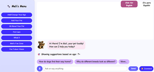
Meli’s World (meliworld.ai—coming soon)
Meli’s World is designed to help children feel supported, understood, and emotionally safe through a bilingual, emotionally intelligent digital companion
Designed with advanced Generative AI (Groq/Llama3, Claude AI, ChatGPT) and a responsive HTML/CSS/JavaScript front end, Meli’s World delivers a safe, engaging, and developmentally aware experience that grows with the child. Available on: Laptop, tablet, and mobile — with a mobile app in development supporting natural speech-to-speech and text-to-speech conversation.
💖 Core Experience Differentiators- Built for Emotional Trust — Designed from the ground up for safe, empathetic child interaction, not retrofitted from adult voice assistants.
- Age-Adaptive Design — Dynamic font scaling, content complexity, and UI behavior adjust automatically for ages 2–3, 4–6, and 7+.
- Therapeutic Conversations — Multi-step dialogue paths supporting grief, anxiety, loneliness, academic stress, and emotional regulation.
- Real-Time Bilingual AI — Seamless English/Spanish interaction with context-aware language detection and culturally nuanced responses.
- Educational AI Engine — Covers STEM, literacy, geography, and social-emotional learning topics through conversational play.
- Hybrid AI System — Cost-optimized architecture blending hardcoded emotional intelligence (8+ emotion types) with LLM creativity, reducing operational costs while maintaining therapeutic-grade responses.
- Native Bilingual Engine — First-of-its-kind AI engine generating age-appropriate stories directly in English/Spanish with bidirectional caching to eliminate translation artifacts.
- Advanced Story Creation — Interactive system enabling personalized story generation with family member integration, theme selection, and real-time language switching.
- Production-Grade Platform — Responsive HTML/CSS/JavaScript foundation with Microsoft Speech API integration for full speech-to-speech interaction.
- Blue Ocean Positioning — The only platform combining developmental adaptation with bilingual AI for early childhood (ages 2–8).
- Underserved Market Focus — Specifically addresses 12M+ bilingual U.S. households often overlooked by English-only competitors.
- Scalable Revenue Model — Freemium structure with premium content packs, enterprise licensing ($50–200/seat), and strategic partnership potential.
- Investment-Ready Traction — Working prototype live with LLM integration and hybrid emotional logic; clear path to $4M ARR by Year 3.
Copyright 2025 Bill & Julie Tedder
All rights reserved.
Amazon Publications
eBook - Meli's Grand Adventure
Paperback - Meli's Grand Adventure
Paperback - Meli's Grand Adventure Coloring Book
Children's Paperback Book - Meli's Grand Adventure
The following pages are excerpts from the paperback book . . .


Children's Coloring Book - Meli's Grand Adventure
I have also created a children's coloring book for children ages 3-8 years old (soon to be published). It is based on the eBook called "Meli's Grand Adventure". It is titled "Meli's Grand Adventure: Coloring Book". The following pages are excerpts from the book . . .


Click Here to View Meli's Website
Case Study: Network Address Translation – Configuring NAT in a CLI Simulation
Project Overview
A technical learning, network simulation where users configure Dynamic NAT/PAT in a command-line interface. The focus was on usability testing, instructional clarity, and improving learner success in a high-stakes IT task.
Role: UX Researcher, Instructional Designer, Flow Architect
Tools: RouterSim, Java, JavaScript, Figma, Adobe Illustrator
Research & Goals
Learners were consistently failing a key CLI simulation in RouterSim related to NAT configuration. Our goal was to identify where learners struggled, measure behavior patterns during CLI input, and redesign the instructional flow to improve comprehension and task success.
The Instructional Scenario
“The senior network administrator at Gadget Research Company needs you to set up NAT on a network. Ensure that all internal users can access the Internet. You have a company of 20 users. EIGRP has been configured on internal routers.”
- Configure Dynamic NAT/PAT using subnet 40.0.0.16/28
- Create NAT pool GADGET-NAT-POOL
- Set up NAT access list and default routes
- Configure static routing on the ISP
UX & Instructional Design Process
- Conducted keystroke-level usability testing with 20 learners
- Identified pain points: incorrect ACLs, NAT overload syntax errors, missing routes
- Mapped complete task flow in Figma
- Redesigned instruction sequencing and added inline guidance
Analysis
Generated an assment report of the user's actions. Focused on common problem areas:
- Incorrect NAT access list statements
- Misconfigured NAT overload syntax
- Omitted default routes
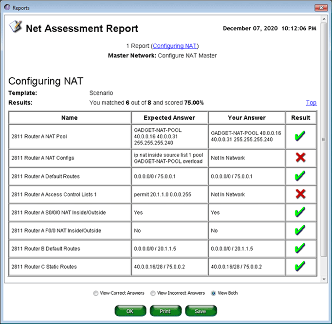
Key Insights
| Insight | Impact |
|---|---|
| Users skipped or miswrote NAT access lists | NAT failed silently, leading to frustration |
| “Overload” keyword often omitted | No NAT translation, blocking Internet access |
| Inside/outside interface mislabeling | Broke task flow early, increasing abandon rates |
| Guided syntax helped learners succeed | Reduced trial-and-error input and frustration |
Outcomes
Iterative redesign and programming development produced the following results:
- 35% increase in task success rate
- 27% reduction in average completion time
- Reduced support requests due to instructional clarity
- UX improvements applied to other CLI modules
Reflection
This project reinforced the value of bridging UX research and instructional design. By analyzing real user behavior at a keystroke level, we uncovered not just what went wrong—but why. That led to targeted improvements in both content design and simulation behavior.
Case Study: Construction Claims Website – IRAM
Project Overview
A legal content system used by lawyers, contractors, and project managers needed modernization. I led the redesign and development of an intuitive, responsive web experience that made complex construction law topics easy to find and use.
Role: UX Designer, Developer, Content Strategist
Tools: HTML5, CSS3, JavaScript, Adobe XD, Balsamiq
Research & Goals
The original application was difficult to navigate, lacked search capabilities, and had inconsistent terminology. I interviewed key user groups to understand their needs and friction points, and identified major usability gaps.
Design Strategy
- Created a web-based, menu-driven experience with both side and top navigation to provide structured pathways through dense material
- Used accordion-based categories to reduce cognitive load and avoid overwhelming the user
- Designed interactive learning aids:
"For Example" and "Remember" icons launched contextual pop-ups for real-world scenarios and definitions - Integrated search functionality and glossaries for faster content retrieval and self-guided learning


Information Architecture & Design Process
- Created a new site map grouped by user role (Contractor, Lawyer, etc.)
- Introduced collapsible navigation and glossary-based architecture
- Developed icons and instructional callouts to reduce reading fatigue
- Used HTML/CSS/JavaScript for final responsive implementation
Key Insights
| Finding | Design Response |
|---|---|
| Users forgot key legal definitions | Added glossary popups and hover terms |
| Lawyers needed dual-context access | Built side-by-side tabs: Law vs. Examples |
| Scrolling fatigue | Implemented collapsible menus and sticky nav |
| Overwhelming text blocks | Chunked content into clear, skimmable cards |
Outcomes
- Reduced user effort and information-seeking time
- Improved learning engagement across user roles
- Established scalable content patterns for future modules
Reflection
This project showed how UX principles can simplify high-stakes legal information. Understanding domain-specific workflows helped me design a tool that was both functional and approachable.
Case Study: Meli's Grand Adventure – AI-Powered Publishing
Project Overview
I created and published a children’s storybook and companion coloring book using generative AI tools. This tested the potential of AI for storytelling, illustration, layout, and multi-format publishing.
Role: Product Designer, Illustrator (AI-powered), Publisher
Tools: ChatGPT, DALL·E, Figma, KDP (Amazon), Canva
Goals
- Create character-driven content using ChatGPT and DALL·E
- Design visuals that appeal to children ages 3–8
- Format and publish via Amazon KDP
- Build an integrated website and social presence for the character
Process
- Scripted the story with conversational AI tools
- Used prompt engineering to generate consistent illustrations
- Formatted layouts in Figma (storybook + coloring book)
- Managed publishing specs: bleed, resolution, color space, and layout
- Built Meli’s website and social media identity
Key UX Decisions
| Challenge | Solution |
|---|---|
| Maintaining character consistency | Used prompt stacking with reference constraints |
| Making child-friendly images | Emphasized white space, soft color palettes |
| Ensuring print quality | Used 300 DPI, vector-style, and line-only for coloring pages |
| Extending brand experience | Created a story-driven website and Facebook page |
Outcomes
- Published 2 polished, age-appropriate products on Amazon
- Tested a replicable model for AI-powered publishing
- Created a character brand with room for expansion
Reflection
This project merged creativity, storytelling, and UX strategy—powered by generative AI. It deepened my understanding of how emerging tools can support lean content production and user-centered design.
PRISM™
Decision‑Driven
AI for Job Applications
A pre-application intelligence system that evaluates job–resume fit, tells you whether to apply, and shows you exactly what to improve before you do. Designed by someone who built it because he needed it.
Origin: The Research Was Personal
PRISM began as a response to a problem I experienced firsthand. I was already doing what most job seekers consider due diligence — screening roles carefully, visually inspecting job descriptions, and using AI-assisted resume tailoring to match language and optimize for ATS. I was doing manually what PRISM does systematically. And I was still not getting the outcomes I expected.
That raised an uncomfortable question I couldn't ignore: if careful manual analysis and AI-assisted optimization don't guarantee outcomes, why build a tool to automate them? The answer, I realized, wasn't about the resume at all. It was about decision quality — the layer that comes before any optimization. The tools were doing their job. The missing piece was a system that made the reasoning visible, consistent, and improvable over time.
This gave me a research foundation most designers don't have: I was simultaneously the designer, the user, and the primary research participant. Every application became a data point. Every outcome — expected or not — sharpened the problem definition. The insight was real, and that specificity is exactly what PRISM is built on.
The Problem
The job application market is flooded with tools that help candidates write better resumes, generate cover letters, and optimize for ATS keywords. These tools solve a surface problem — how do I present myself? — while ignoring the more fundamental question: Should I be applying to this role at all?
The core dysfunction: candidates treat job applications as a volume game, applying broadly and hoping something connects. This wastes time, erodes confidence, and generates no useful signal. The missing layer is a decision-first AI system that performs strategic analysis before the resume is ever submitted.
Before vs. After PRISM
❌ Without PRISM
- Read job description, feel a rough match
- Spend 2–4 hours tailoring resume and cover letter
- Submit — then wait weeks with no feedback
- Receive rejection with no signal about fit
- Repeat the cycle, gradually losing strategic clarity
✓ With PRISM
- Paste job and resume — receive a fit score in seconds
- Know whether to apply before investing time
- Understand exactly which gaps are hurting you
- Get prioritized actions to improve fit before submitting
- Apply with confidence — or strategically skip
Design Principles
PRISM is a decision-support system, not a content generator. That distinction shaped every design choice. The following six principles guided the system's behavioral and interaction design:
System Architecture
PRISM is a four-stage agentic pipeline. Each stage has a specific responsibility, bounded inputs and outputs, and feeds deterministically into the next. The architecture is designed so that the Decision Engine is never exposed to raw, unprocessed text — it only receives structured signals.
Decision Engine: Key Components
The Decision Engine is the core intelligence layer. It evaluates four weighted factors:
Confidence Scoring Output (Conceptual Model)
Each analysis produces a confidence band, not a binary score. Critically, the same score produces different recommendations depending on context — market conditions, gap severity, and portfolio evidence. Here's how the verdict UI communicates that:
The same 74% score produces a different recommendation depending on what surrounds it:
"That becomes much more intelligent than: 'You match 74%.' Because humans don't make decisions based on one scalar number — they think in risk, effort, upside, credibility, and transferability."
Interaction Design Decisions
The interaction model prioritizes low friction at entry and high clarity at output. Key decisions:
Why paste-and-go input?
Structured forms (dropdowns for industry, role level, years of experience) create cognitive overhead before the user has received any value. Research on form abandonment shows that pre-value friction dramatically reduces completion. PRISM accepts raw text and extracts structure itself — the user experiences zero setup cost.
Why show a confidence band, not a percentage?
A single score (e.g., "72% match") implies false precision and invites gaming. A confidence band with labeled dimensions (skills, experience, gaps) communicates both the verdict and its reasoning, allowing the user to interrogate the result rather than just accept it.
Why prioritize gap severity?
Not all gaps are equal. A missing certification is improvable; a missing 10 years of C-suite experience is not. PRISM distinguishes between blocking gaps (reconsider applying) and improvable gaps (address in cover letter or resume before submitting). This distinction changes the user's action — which is the entire point.
Why skip the cover letter generator?
Deliberately out of scope for v1. Cover letter generation already exists. The design risk was scope creep — adding a feature that dilutes PRISM's decision-first identity. The v1 constraint is a design choice, not a limitation.
Metrics That Matter
PRISM's success metrics are intentionally different from the tools it's designed to replace. Traditional resume tools measure output volume. PRISM measures decision quality.
Traditional Tool Metrics
PRISM Metrics
Design Challenges
Challenge: Avoiding false confidence
A system that tells users to apply with 80% confidence — and they don't get interviews — destroys trust immediately. The solution is explicit epistemic humility in the UI: confidence bands are labeled as probabilistic estimates, not guarantees. The system explains what it can and cannot see.
Challenge: Prompt architecture for consistent output
LLM responses to unstructured job analysis prompts are inconsistent without rigid scaffolding. The solution was structured prompt engineering with explicit output schemas — forcing the model to return JSON with defined fields rather than narrative prose, then translating that structure into the visual output layer.
Challenge: Handling underspecified job postings
Many job postings are vague. "5+ years of experience" with no context. "Strong communication skills." PRISM must surface when the input quality is too low to generate a reliable signal — and communicate that limitation honestly rather than fabricating confident-sounding output.
Challenge: Resisting scope creep
The natural pull in any resume-adjacent tool is toward feature bloat: add a cover letter generator, a LinkedIn optimizer, a portfolio reviewer. Every one of these features was considered and intentionally deferred. PRISM's core value is decision clarity — everything else dilutes it.
Development Roadmap
Reflection
PRISM is the most personally grounded system I have designed. Every design decision was tested against lived experience — not a user persona, but the actual friction of being a senior designer navigating a competitive and often opaque hiring market.
What the project demonstrates beyond its surface function is a design philosophy I've developed across 15+ years of system work: the most valuable AI systems don't generate content — they generate clarity. They take ambiguous, high-stakes situations and give people the structured signal they need to act with confidence.
PRISM is also a statement about what AI product design at the system level looks like. It required not just interface design, but prompt architecture, output schema design, confidence modeling, interaction logic for ambiguous inputs, and a principled definition of what the system should refuse to do. That is the work I want to keep doing.
Case Study: Conversational & AI System
Project Overview
MeliWorld AI is a conversational companion designed to provide emotionally supportive, developmentally appropriate interactions for children. I designed the conversational system architecture, including emotional signal detection, hybrid safety routing, and age-adaptive UX patterns that make probabilistic AI behavior predictable, safe, and trustworthy.
The system combines deterministic UX logic (emotion detection, safety rules, and behavioral constraints) with LLM-based generation to balance creativity with control.
It operates through modular, agent-like workflows (Emotion, Safety, Story, Translation) that interpret user input, apply safety constraints, and generate context-aware responses in real time.
This architecture ensures that each interaction is emotionally aligned, developmentally appropriate, and consistently safe across unpredictable user input.
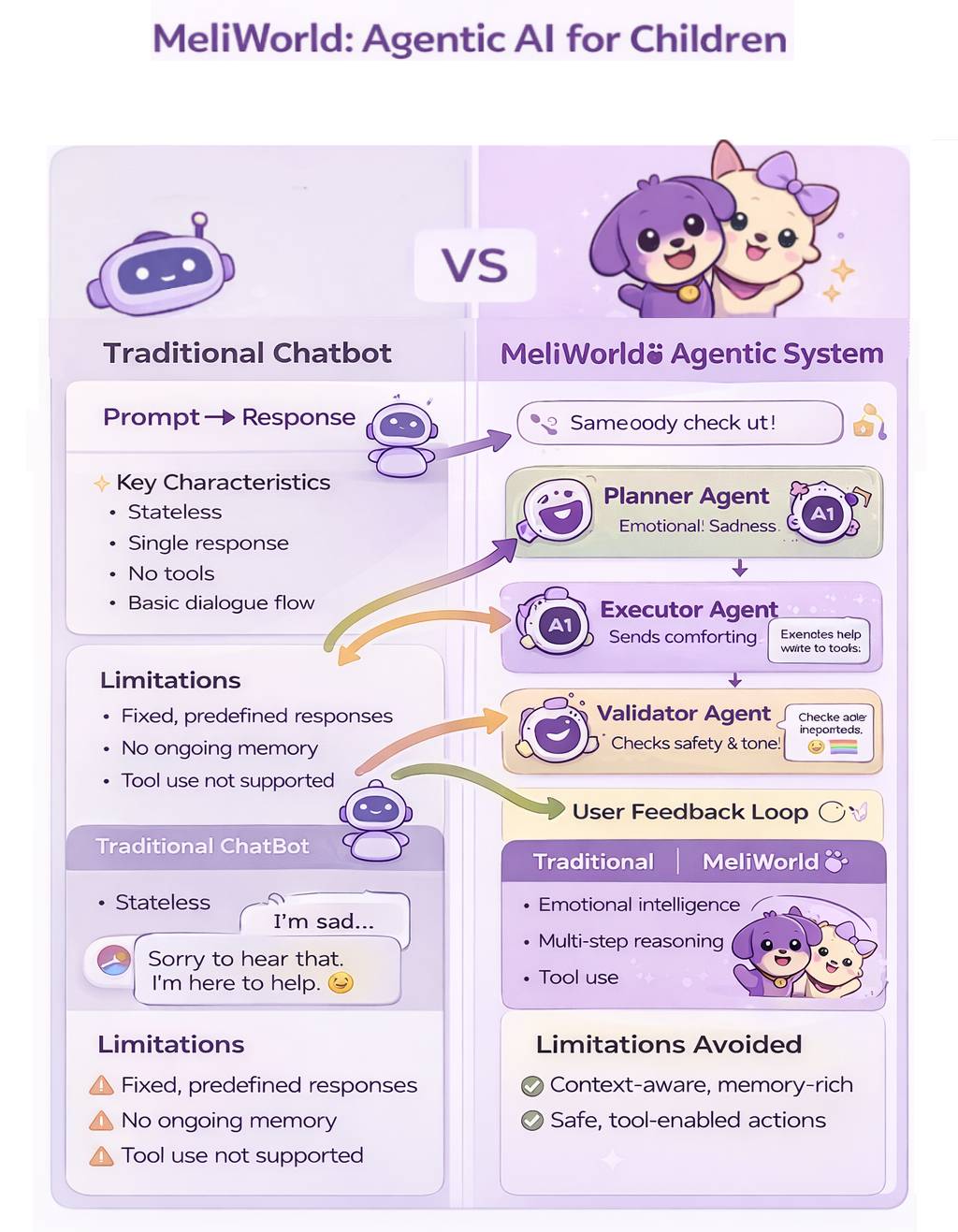
From single-response chatbots to structured, safety-aware agentic systems.
This hybrid architecture separates emotionally sensitive inputs from open-ended generative interaction, ensuring predictable emotional safety while preserving conversational richness and creative flexibility.
I designed this architecture using a modular conversational routing model that balances emotional safety, response appropriateness, and generative flexibility—an approach aligned with emerging best practices used in production-scale conversational AI systems.
Role: Product Designer, Conversational UX Architect, System Interaction Designer
Response Flow & Execution
How user input is analyzed, routed, and transformed into a final response.
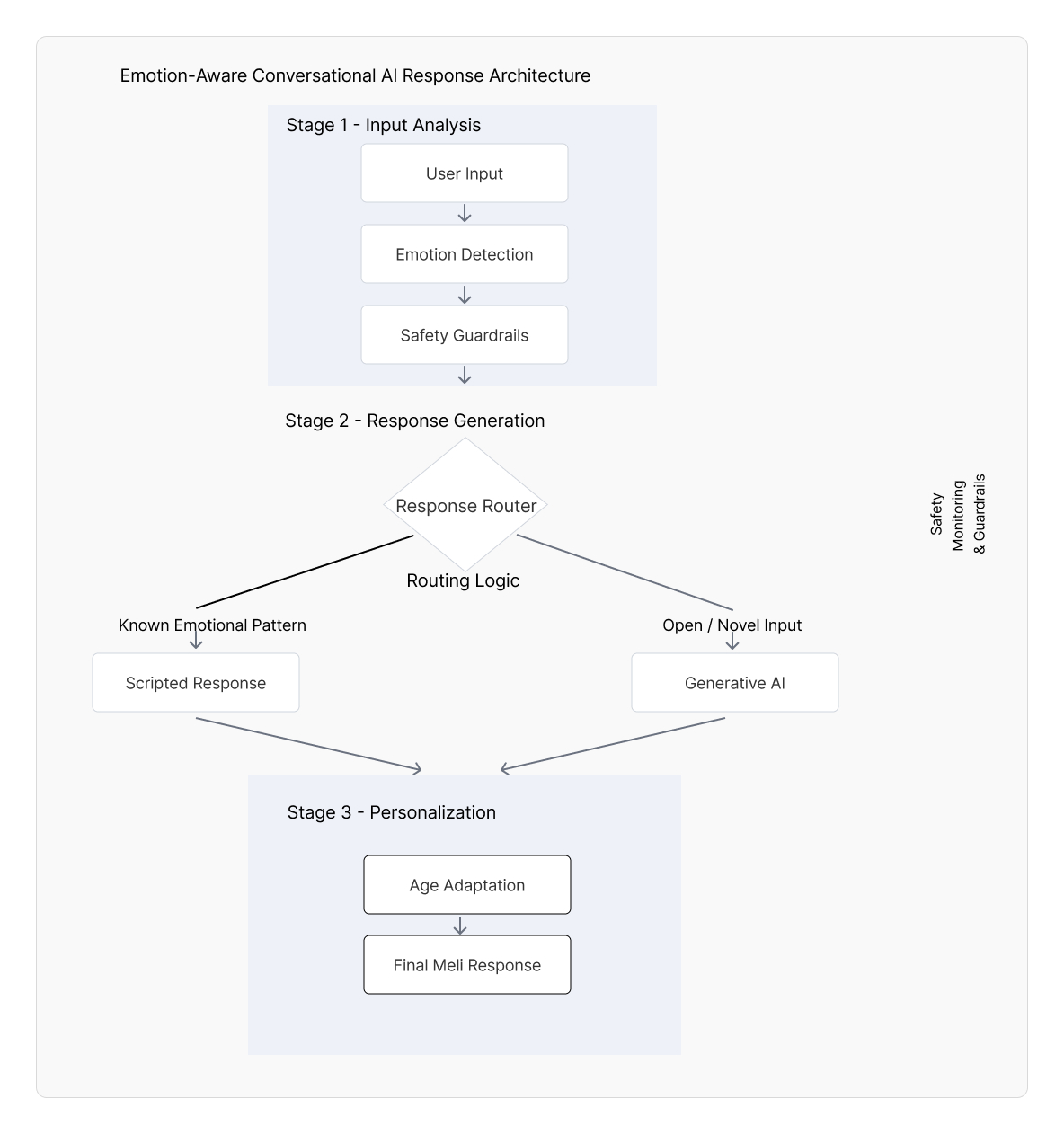
From emotion detection to hybrid routing—delivering safe, adaptive responses.
Platform
Web prototype (text + voice capable)
Core Contributions
Conversational architecture, emotional routing framework, prompt scaffolding, age-adaptive interaction design
Focus Areas
Emotional intelligence, safety guardrails, prompt architecture, conversational routing and agentic orchestration
Problem
LLMs can sound empathetic, but their behavior is probabilistic and can vary in tone, appropriateness, and helpfulness. For children (and emotionally sensitive moments), inconsistency can reduce trust and create safety risks. The design challenge was to create a system that delivers emotionally reliable responses while still enabling creative, open-ended conversation.
Design Goals
- Deliver emotionally supportive, child-appropriate conversational experiences
- Increase predictability and safety during emotionally sensitive user inputs
- Implement a hybrid architecture balancing reliability (deterministic) with richness (generative)
- Adapt language complexity, response length, and UI readability by age group (2–3, 4–6, 7+)
- Reinforce trust through consistent tone and interaction structure
System Architecture
Two-Layer Response Model (Hybrid Routing)
Layer 1 — Deterministic Emotional Safety Layer: detects emotional signals (e.g., “sad,” “scared,” “lonely”) and routes to pre-validated supportive response patterns for predictable safety.
Layer 2 — Generative AI Layer: handles open-ended conversation (curiosity, storytelling, questions) when the input is not flagged as emotionally sensitive, constrained by prompt scaffolding and tone rules.
Emotional Intelligence Framework
User input → emotional keyword detection → classification → response pattern selection → delivery
This routing approach improves emotional reliability and reduces unexpected responses during sensitive moments.
Age-Adaptive UX
- Ages 2–3: very simple language, short responses, extra warmth and reassurance
- Ages 4–6: medium-length responses, simple explanations, gentle curiosity prompts
- Ages 7+: longer responses, richer detail, more autonomy and reflective prompts
Prompt Architecture & Behavioral Constraints
- Personality consistency anchors (friendly, calm, supportive)
- Tone constraints for child-appropriate responses
- Behavior-shaping instruction hierarchy (clarity, reassurance, safe boundaries)
- Structured response patterns to reduce variance and improve predictability
Key UX & System Design Decisions
| Challenge | Solution |
|---|---|
| Emotional vulnerability in user inputs | Deterministic “safe path” routing using an emotional keyword library and pre-validated supportive responses |
| Unpredictable AI behavior | Hybrid architecture: safety layer first, generative layer second (with prompt scaffolding constraints) |
| Different developmental needs across ages | Age-based adaptation for language complexity, response length, and UI readability |
| Trust and clarity in conversation | Consistent personality/tone + structured responses that help users form reliable mental models |
| Making AI feel supportive without overreach | Designed boundaries and supportive “next step” prompts |
Outcomes
- Built a functional prototype demonstrating emotional routing + age-adaptive conversation patterns
- Established a reusable emotional response library to improve consistency and safety
- Validated hybrid routing as a practical approach to balancing safety with creativity
- Created a scalable foundation for voice-first and bilingual expansion
Reflection
MeliWorld reinforced that conversational AI design is a behavioral design. The model matters, but reliability and trust come from routing, constraints, prompt scaffolding, and interaction patterns that make probabilistic systems feel understandable and safe.
UX/Instructional Writing Samples
The following are UX/Instructional writing samples that are derived from user guides, websites, and software applications that I was involved in their creation. Click on the corresponding button next to the title to view the related pdf file.
Mobile Apps
Colorado Avalanche Dashboards
The Colorado Avalanche were Stanley Cup champions in the 2021-2022 season. To commemorate their 2021-2022 season, dashboards were created that detail their month-to-month, regular season, win record, from October 2021 to April 2022. This mobile app was created with Figma . . . (Click arrows  to expand window)
Wedding Photographer
I created a high fidelity mobile app design based on the work of a professional photographer. I first wanted to provide striking images that could be reached from the main screen. I inserted a small visual guide, informing users that they could scroll vertically down the screen. I also wanted to provide vital information about the business, such as pricing. I created a section on valuable FAQs, which displays a scrollable menu and by simply clicking on a question, a response to that specific FAQ would display on the right side of the screen. This prototype was created with Figma . . . (Click arrows to expand window)
This is a mobile app for a company that provides over 200 pre-employment tests. This app is easy to use via scrollable menus. This was created with Figma . . . (Click arrows to expand window)
Resource Associates (https://www.resourceassociates.com) offers over 200 pre-employment tests available on demand on their web site. Users can obtain a rich amount of information to aid in the selection of a test. I designed the following wireframe that forms the basis of a mobile app that I developed.
The wireframe prototype was developed with Axure RP.
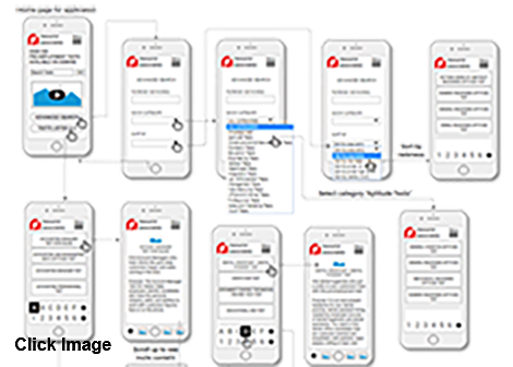
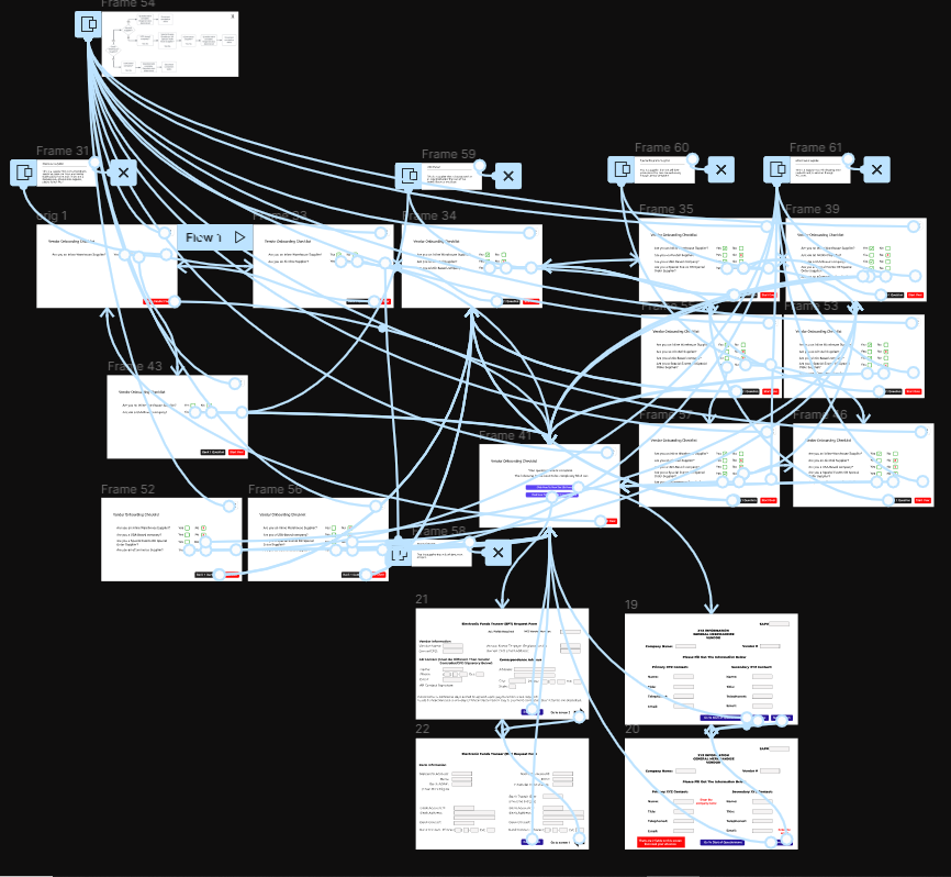
Vendor Onboarding
At XYZ.com, the original manner of vendor onboarding was where employees would manually enter information into the system, from data sheets. This process was bogged down by duplication and vendor errors. This prototype provides a quicker process for determining which documents that vendors should obtain and fill out. After each question is answered (Yes or No), the next question is automatically displayed, based on the vendor's choice.
This prototype was created with Figma . . . (Click arrows to expand window)
Visually, the solution is ostensibly simple, however, the app had to account for all possible vendor responses. You can see that in the image below (lines and arrows) with a connection map.
I have been touched by the efforts of groups throughout the world that tirelessly work toward saving our oceans and planet, and ameliorating our climate crises. I wanted to find a brief but comprehensive way present to visuals, related text, and links to organizations throughout the world. Therefore, I created a prototype with Figma . . . (Click arrows to expand window)
Web Sites
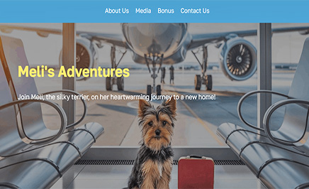
Meli's Grand Adventure
This web site is based on a paperback book titled "Meli's Grand Adventure". It is about Meli, the silky terrier, on her heartwarming journey to a new home from Pennsylania to Colorado.
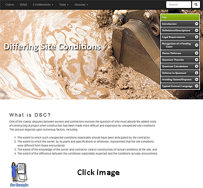
IRAM
This web site is based on a desktop application created years earlier. There was a need to convert this desktop application into a web site using traditional front end tools. Without this web site there would be no way to explore and retreive digital information on the subject matter. This site provides a means by which construction owners and contractors can easily access all of the information required to identify, recognize, analyze and manage potential construction contract claim and dispute situations. The site was constructed using HTML5, CSS3, and JavaScript. Glossaries are provided. A full web site search function is available.
Use the username (esteem) and password (456) to access the IRAM website.
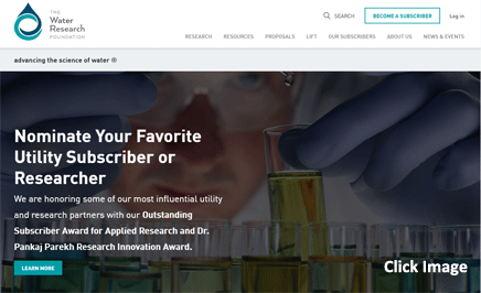
Water Research Foundation
The Water Research Foundation (WRF) is the leading research organization advancing the science of all water to meet the evolving needs of its subscribers and the water sector. This site was constructed using WordPress.
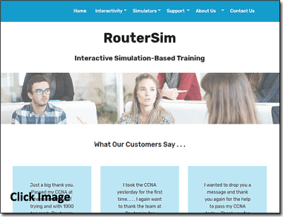
RouterSim Web Site
I created and have maintained the RouterSim web site from its inception. This site was recently revamped with Bootstrap and JavaScript.
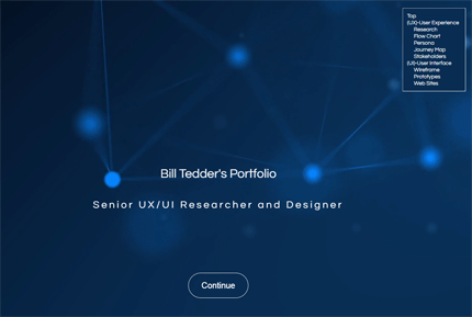
My Portfolio
I recently revised my portfolio website with Bootstrap, HTML5, CSS3, JavaScript, and JQuery. The original site was menu driven only and displayed content on several pages. Users can navigate the current site by using the menu on the right side of the screen or vertically scrolling down the page with a mouse.
The current site presents several new features:
Parallax pages
Pop-ups
Portfolios that link to InVision
Animation of text and images with the use of wow.js
Page space is conserved by presenting 12 UX research topics in the same page location by using JQuery
As before, the site's responsive design allows all devices (i.e., smart phone, tablet, tablet horizontal, or desktop view) to properly display page elements
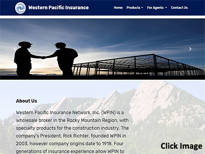
Western Pacific Insurance
This revamped web site was modified with Bootstrap 4.0.
The responsive design allows all devices (i.e., smart phone, tablet, tablet horizontal, or desktop view) to properly display page elements.
The client wanted a carousal of pictures, revolving at the top of the landing page.
The client wanted a concise site with few pages.
Several topics are presented on the Products page and users can vertically scroll down the page.
Users can also click on sub-menu items and the use of anchors has the program vertically scrolling to the desired position on the page.
Design Thinking (HCD)
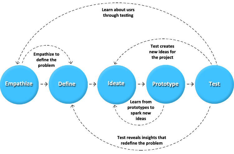
With the aspect of creating a software application that allows users to interact and learn with a simulator (virtual network), I wanted to develop a meaningful and systematic approach to solving problems. I wanted to use a framework that was very user-oriented and promoted user empathy. Two other requirements were a non-linear process that allows for multiple iterations in examining issues and problems. Design Thinking and human-centered design were chosen as the methodologies that would be used. They were employed in the design and development of two dozen RouterSim products. Both methods share several similarities:
- Empathy
- Prioritizing the needs and experiences of the user or customer
- Iterative cycles of prototyping, testing, and refining ideas and solutions based on feedback
Several employees were invited to the Design Thinking meetings:
- Potential Users
- Java Developers
- Designers
- Technical Support
- Sales & Marketing
The following, typical areas were dealt with in the Design Thinking processes.
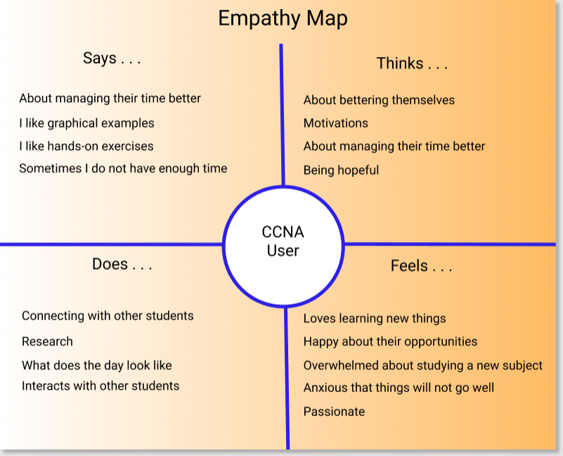
The first part of Design Thinking involved conducting ethnographic research. I observed actual users and examined learning methods that they currently employed in learning Cisco material. I was careful to not prematurely make assumptions and draw conclusions. Journey maps and empathy maps were used in tracking the interaction that users had with their learning environment. It helped identify needs that users were often unable to articulate. A subject matter expert was used so that their input could also be used to identify user needs. It was observed that users:
- Could read one or more books. A user can view images in books but are extremely limited in being able to have hands-on experiences and work with different network configurations.
- Attend a seminar. But users can only learn through hearing and seeing visual presentations. No ability to have hands-on experiences.
- Purchase routers and switches. Considering that you have to purchase several devices in order to create a modest network, this is financially unfeasible for most.
This was frustrating for users and limited learning experiences and the development of cognitive flexibility. I informally met with small groups who expressed their feelings and we discussed issues. They were encouraged to "storytell" their experiences. I used active listening and empathy while interacting with people.
Define
Card sorting was performed to separate and categorize either problems discussed with users or issues that might be encountered in the development and use of a RouterSim product. Sticky notes were put on a large board and continuously added to and/or rearranged if necessary. The top 5 areas (pain points) of interest were:
- Interface Design and Development
- Building Networks
- Configuring and Testing Networks
- Information Architecture
- Assessing User Skills
The problem statement is "how does the interface look like that is pleasing to the eye, intutive and functional?"
The problem statement is "are there specific steps in building a network (i.e., click on a device button to display the device on the Network Visualizr screen, then connect devices)?"
The problem statement is "how do you use the step-by-step online documentation in conjunction to configuring each device on the screen?"
The problem statement is "Based on suggested features, what is the flow of the program from one screen to another, that is intuitive for user?"
The problem statement is "after going through step-by-step instruction, how are user's problem-solving skills assessed?"
Based on the three levels of software programs that RouterSim wanted to create, plus, the user observation and gathered data, three personas were created. This referred to applications for Cisco CCENT, CCNA, and CCNP.
Ideation
A problem statement was the starting point in visualizing possible solutions. Brainstorming was employed to generate ideas, no matter if they were good or bad. Free association was supported so that ideas could flow without judgement or interruption. Card sorting and sticky notes on a board was used to categorize ideas. The top five or six ideas were used in the creation of prototypes.
Features
There was a special place in this Design Thinking process, the creation of product features. This was an integral process that influenced the success and acceptance of products. I brainstormed and identified possible areas of development:
- Interfaces
- Architectural Flow
- Special User-Related Functionality
- Graphical Objects
- Interaction With A Simulated Network
- Configuring A Network
Storyboard
In examining possible solutions, step-by-step storyboards were created so that the program workflow(s) would be easier to conceptualized and visualized. Information was taken from sticky notes on a white board. After viewing storyboard(s) It was common for Design Thinking participants to either add and/or remove items from the white board. Essentially, this process allowed us to flush out the storyboard(s) into a smoother and more understandable journey.
User Journey Map
In working with current and future users of Cisco learning material it was necessary to create user journey maps. In conjunction with the creation of storyboards, and pre-prototyping phases, the creation of user journey maps allowed me to more closely correlate feelings, thoughts, and potential user interaction with existing prototypes or future ones.
Prototype
One purpose of one or more prototypes is the generation of new ideas. Depending on how many items and/or problems were flushed out, storyboards, mockups, low-fidelity protypes, and high-fidelity were created. Users and teammates would continually provide feedback. Potential customers were first shown paper prototypes. This was based on using sticky notes being reviewed and modified. Prototypes provided a way to see if there were gaps in team thinking and/or if something was missed.
Testing
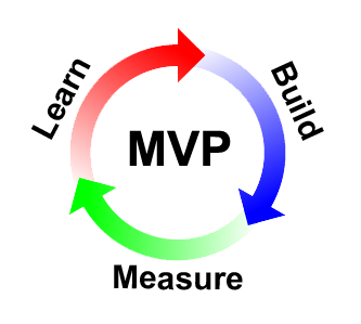
Each potential product was divided into several content areas that was explored within a lean process that provided a minimal viable product (MVP). A minimal amount of the interface, features, and functionality were created and tested by users. There were four main areas that were tested:
- Buttons, graphics, and devices on the Net Visualizer screen
- Information architecture - Does the program and the flow of the application perform as expected?
- Learning - Is the material easy to learn, understand, and allow easy and intutive, user interaction?
- User assessment - Does the program accurately assess user interaction with the MVP?
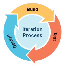
Iteration
Each of the five main areas of Design Thinking was open to iteration so that prior areas could be revisited when new ideas or insights were generated. A non-linear format was supported so that any part of the design process could re-examined. For example, prior assumptions were re-visited to validate the existence of sufficient and valid evidence. Through iteration, it became clearer what part(s) would be examined (or re-examined) for increased clarity and usefulness.
Through iteration, it became clearer what part(s) would be examined (or re-examined) for increased clarity aand usefulness.
WCAG - UX/UI Best Practices Guide
While employed at an earlier position, I was asked to create a WCAG - UX/UI best practices guide. While not being comprehensive in the inclusion of all topics, it provides a general guide to WCAG readibility issues and other user-related interaction.
UX Research - Methods and Strategies
When I co-founded RouterSim we had a great deal of work that was needed to substantiate our hypotheses that network simulators would be a viable alternative to real Cisco routers and switches. The following UX research strategies were utilized in gathering user information. Click on any of the following methods and strategies to learn how they were used in UX research.
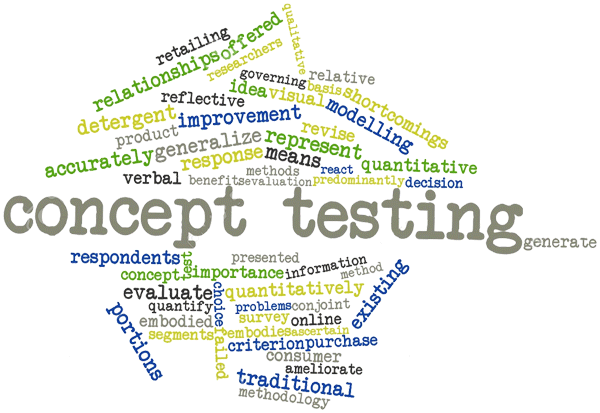
Concept Testing
Concept testing is a key aspect of the human-centered design process and it was utilized by RouterSim. When the initial idea of having a router simulator was spawned, there was no way to intuitively know if such a concept would be accepted. There were none in existent. I conducted ethnograpic studies and observed actual users and examined learning methods that they currently employed in learning Cisco material. I was careful to not prematurely make assumptions and draw conclusions.
I created quantitative surveys and presented them to people in the IT field. People were asked a series of questions about the effort and cost of preparing for a Cisco certification exam. This not only included questions about the use of books but the actual purchase of routers and switches; A very expensive proposition. Feedback from potential users indicated that a low cost simulator would be a boon to the industry.
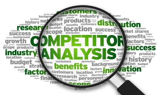
Competitor Analysis
When RouterSim was created, no other company had a network simulator for people in school. Therefore, there was no extensive competitor analysis completed. However, Cisco textbooks were available which provided step-by-step instruction. In order to practice you would have to have access to real equipment which is potentially expensive.
At a later date another company started producing a simulator and we had to periodically conduct competitor analysis on their products. Eventually Cisco produced a simulator and we again needed to periodically conduct competitor analysis. RouterSim interfaces were developed based on our theoretical approach and deficiencies that were noted in competitor products.
Surveys
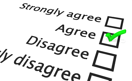
When new products were planned, I gathered a great deal of information about potential users. I wanted to create and present relevant information based on the background, knowledge level, and goals of the user. Another key factor was that a user may be studying for a specific Cisco certification exam and a specific technical level.
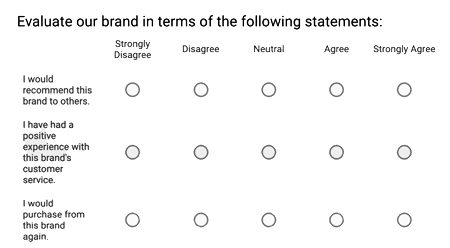
I created surveys based on the 5-point Likert Scale. A Likert scale is a psychometric scale commonly involved in research that employs questionnaires. It is the most widely used approach to scaling responses in survey research.
Contextual Inquiry
Observation was recorded at various points of discovery and usability. I observed how people studied and prepared for Cisco exams by using books and real equipment. I conducted remote moderated and unmoderated research. This was usually one-on-one interaction in which I watched the user in the course of the user's normal study activities and discussed those activities with the user.
I recorded "pain points", points of motivated behavior, and times of frustration. When presented with prototypes, people would be video taped.

User Interviews
I interviewed people that were studying for their Cisco certification exam or had recently taken it. I wanted to investigate their experiences and especially their feelings. I used a survey with the Likert scale plus an open ended one. The following are common themes reported:
- Understanding complex topics
- Feelings of being overwhelmed was a prevalent response
- Time management – spending too much time on a question during a prep exam or actual exam
- Motivation – pacing oneself with other activities in your life to in order to schedule time dedicated toward studying
- Money – students in poorer countries cannot afford books and/or equipment
- More Money – Traveling to Cisco test center + Cisco certification exams is prohibitive to some students

I did a deeper dive in understanding how well users could deal with networking issues. Ie wanted to examine the speed at which a user could successfully accomplish tasks. I constructed assessments that were drawn from current literature of the Cisco areas of CCENT, CCNA, and CCNP. Users were presented with topics that had increasing levels of complexity and possible responses (i.e., single multiple-choice response, more than one correct answer, etc.). I examined the data and saw three main see clusters of information highly correlated with specific levels of Cisco-related accomplishment and/or expertise. This allowed me to establish three baselines for the creation of RouterSim software.
RITE Testing
I have worked in a Kanban environment and because of the natue of the products that have been developed a waterfall methodoligy would not be compatible with the development tasks. I have worked with users in continuous iterate, usability tasks.
This is closely aligned with RITE (rapid iterative testing and evaluation). I see this approach as more focused testing which is a usabity testing method that usually involves a small number of participants. The key premise is to identify not just usability problems, but also to react quickly to identified issues and test new solutions. There could be multiple RITE episodes within the broader concept of Design Thinking testing. I went through several iterations with think-aloud exercises.
Personas
I examined common factors among potential users:
- Age and gender
- Education level
- Immediate professional goals for the near future
- Current occupation
- Knowledge of Cisco related networking tasks
- How a user might interact with RouterSim products
- How additional knowledge of networking would be used
I did a deep dive into understanding how well users could deal with networking issues. We wanted to examine the speed at which a user could successfully accomplish tasks. I constructed assessments that were drawn from current literature of the Cisco areas of CCENT, CCNA, and CCNP. Users were presented with topics that had increasing levels of complexity and possible responses (i.e., single multiple-choice response, more than one correct answer, etc.). I examined the data and saw three main clusters of information that highly correlated with specific levels of Cisco-related accomplishment and/or expertise. This allowed us to establish three baselines for the creation of RouterSim software.
User Journey Maps
Based on personas that were established, customer journey maps were created. These were end-to-end encapsulations of what a customer (user) thought, felt, and behaved through “touchpoints” in their journey. Graham (2007) stated that “touchpoints are the key building blocks of experiences. He further defines episodes, experience and end-to-end experience on the basis of touchpoint.
- "Episodes are groups of touchpoints"
- "Experience is all the individual touchpoints or episodes that make up a purposeful activity by a customer"
- "End-to-end experience refers to longer experiences made up of a number of episodes”
Stakeholder Interviews
There were four stakeholders that I interacted with and interviewed. They played key parts in the growth and success of RouterSim. Two were resellers and had specific commercial needs in branding and selling RouterSim software.
Todd L. - Cisco Subject Matter Expert
Neil E. - Publisher at Sybex and John Wiley and Sons
John L. - Professor of Psychology
Takashi S. - President of Logic Vein
Analytics
Initially I needed to find what aspects of presenting a router and switch simulator to people in the IT field would surface in studying needs. I needed to find out what users actually wanted. Qualitative and quantitative research was conducted. Qualitative research included:
- Concept testing
- Focus groups
- Customer feedback
- Ethnographic field study
Quantitative research that I conducted included:
- Surveys (usually using a Likert scale)
- Stakeholder interviews
- A/B testing
- Multivariate testing
- Prototyping
- User assessment
The data was also translated into graphic charts and examined. This greatly assisted in the creation of multiple personas which in turn guided us in setting levels of complexity in the step-by-step labs.
Heuristic Analysis
I tested the usability of software and documentation. I developed different user personas based on the prior knowledge of users and future goals. Some were new to the world of Cisco hardware and configurations, while others had been working in the IT field for several years. Users were timed on how long it took them to complete tasks using the software. Written and verbal feedback was recorded. I conducted remote moderated and unmoderated research. I re-examined and modified personas, where needed, for each of the over two dozen products that were created.

Card Sorting
Mental models of users traversing the navigation options of the software were examined with this technique. The layout and presentation of documentation was also examined with this method. Open and closed sorting were used in looking at clustered data. Information was placed on "sticky notes" and a white board. After viewing storyboard(s), it was common for Design Thinking participants to either add and/or remove items from the white board. Essentially, this process allowed me to flush out the storyboard(s) into a smoother and more understandable journey.
A/B Testing
I tested user interest in and engagement with RouterSim software by examining variations of attributes in an A/B format. Screen attributes were examined such as color foreground and background, font style or size and device size. Users were randomly divided into two groups, one a control group and the other were usually presented with a single variant.
Audio responses of users were recorded and data from short questionnaires were garnered. Attitudinal responses to different devices (graphical representations of routers and switches) were examined by the use of a Likert Scale. I conducted remote unmoderated research that automatically timed how long it took users to accomplish tasks.
Examples . . .
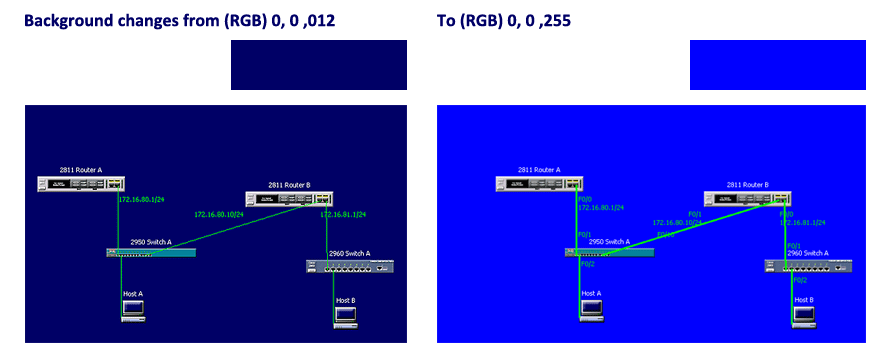

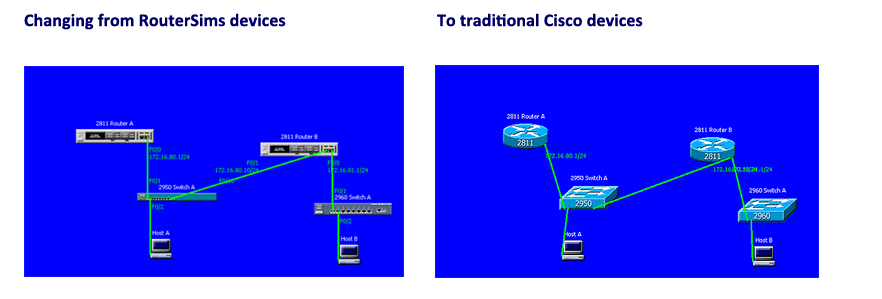
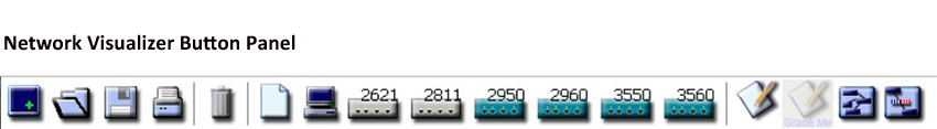
All RouterSim products had one thing in common, a Network Visualizer screen where users could build and test virtual networks. At the top of the screen were buttons on a button panel. I had to create icons that best represented actions associated with button. A/B testing testing was utilized to compare several variations of each button. Users were asked to provide feedback as to the intended action of each button after looking at the button icon. This allowed me to closely fashion each button to it's associated action.
Flow Chart
Toward the end of the UX research, based on UI specifications I created a flow chart for the Network Visualizer program. It was important to capture every screen asset (buttons, tabs, link to screens, etc.) so that programmers had a clear idea when they started creating Java code.
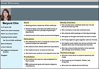
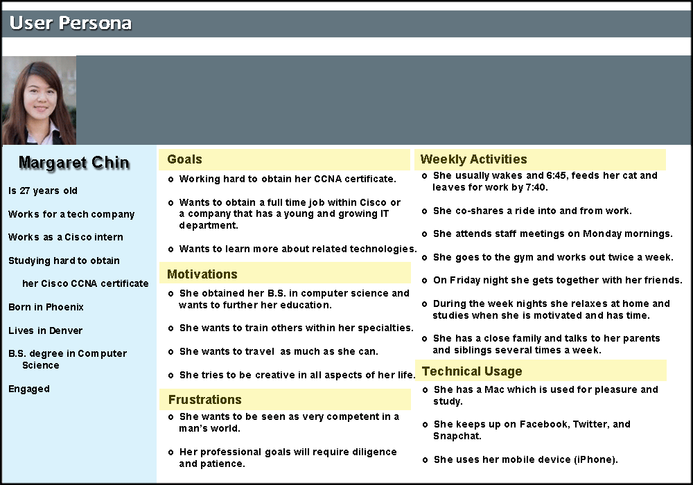
Persona
Based on UX research it was decided that three types of eLearning products would be initially developed. Each one would be more difficult and sophisticated. Three distinct personas were developed. The categories for each one were:
- General Biography
- Goals
- Motivations
- Frustrations
- Weekly Activities
- Technical Usage
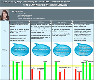
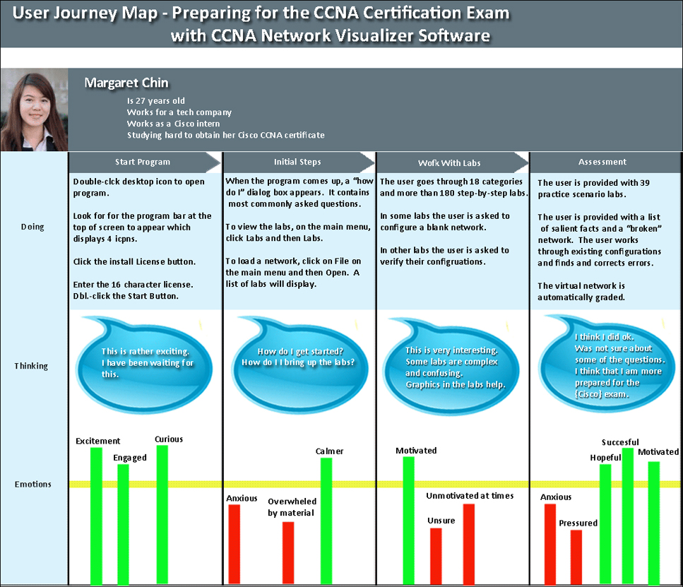
User Journey Map
In working with current and future users of Cisco learning material it was necessary to create user journey maps. It allowed RouterSim to more closely match user experiences and potential success with future products. The following user journey involved a person preparing for the Cisco CCNA Cetification exam. They used a prototype of Routersim's product, CCNA Network Visualizer. At various points in the program I captured a user's "Doing", "Thinking", and Emotions." Of interest is the clear report of positive and negative emotions.
Interaction with Stakeholders
There were four stakeholders that I interacted with and interviewed. They played key parts in the growth and success of RouterSim. Two were resellers and had specific commercial needs in branding and selling RouterSim software.

Todd L.
Todd L. was a partner at RouterSim and was the subject matter expert in the development of simulation-based training software. He has published over 80 books on IT topics through Sybex, a division of John Wiley and Sons (San Francisco, CA). Todd L. supplied the hardware (routers and switches) to RouterSim, plus more importantly, offered his knowledge of the IT field and the potential users of RouterSim software. He played an integral part in assisting in the development of user personas. I used active listening in trying to assuage Todd’s feelings, plus I was a liaison between him and the programmers and used the same techniques in bolstering the programmers.

Neil E.
Neil E. was vice president and publisher at Sybex and John Wiley and Sons (San Francisco). Because of his relationship with Todd L., he was introduced to the possibility of branding RouterSim software and selling it in book stores and eventually over the Internet. After several meetings with him by Todd L. and me, a positive relationship was established. I served as the liaison between the two companies and worked with them in developing their branded software and user manuals. I worked with Sybex employees in creating all user documentation. In the first year that Sybex offered the software on Amazon, sales reached a ranking of third..

John L.
John L. was a professor in the department of psychology at the University of Tennessee. He is currently president of Resource Associates, Inc. He was a partner at RouterSim for some time. He specializes in testing, research methods, psychometrics, and human resources management and authored over 100 scholarly articles. I met John years ago when I attended the University of Tennessee. RouterSim developed several personas of potential users of our software and John L. was an invaluable asset in this effort. He was the subject matter expert in testing and research methods.

Takashi S.
Takashi S. resides in Japan. He is President of Logic Vein. He became aware of RouterSim software and contacted us. He wanted to be an exclusive reseller in Japan. After several email exchanges we met with him in San Francisco to discuss and establish a relationship. The relationship was very positive but challenging. They wanted to brand RouterSim software and translate it into their language. They had to translate our documentation into Japanese, plus, work with us on a constant basis to integrate Japanese words, phrases, and symbols into RouterSim software. One thing I discovered was how precise they were while testing our software. That was a personal challenge for me.
IRAM Site Map (Created with Figma and Autoflow plugin)
This web site provides a means by which construction owners and contractors can easily access
all of the information required to identify, recognize, analyze and manage potential construction
claim and dispute situations.
During the conceptualization and research phases for new products I used my instructional design skills. For each product that I have worked on, I performed needs assessment, gap and tasks analysis. I established user personas, learner profile(s), and learning objectives. It has always been imperative to interact with potential users in an iterative way (Design Thinking) to make sure that the planned application would be engaging, meaningful, and relevant to their professional goals.
With the aspect of creating a software application that allows users to interact and learn with a simulator (virtual network), I wanted to develop a meaningful and systematic approach to solving problems. I wanted to use a framework that was very user-oriented and promoted user empathy. Two other requirements were a non-linear process that allows for multiple iterations in examining issues and problems. Design Thinking and human-centered design were chosen as the methodologies that would be used. They were employed in the design and development of two dozen RouterSim products. Both methods share several similarities:
- Empathy
- Prioritizing the needs and experiences of the user or customer
- Iterative cycles of prototyping, testing, and refining ideas and solutions based on feedback
I used the well-known ADDIE and Design Thinking models. I drew from the works of Rand Spiro (cognitive flexibility theory), Roger Schank (problem-based scenarios), and the Don Kirkpatrick model of learning.
Click Here to View ADDIE ExampleClick Here to View Kirkpatrick Example
Design Systems
The following design systems were created for Websites, eCommerce products and MeliWorl AI. Click on the corresponding button next to the title to view the related pdf file.
About Me
I design human-centered AI systems and intelligent product experiences that balance innovation with predictability, safety, and usability.
With over a decade of experience across UX/UI design, instructional design, and product development, I focus on simplifying complex systems into intuitive, usable interactions. My work blends cognitive psychology, learning science, and modern modern AI capabilities to create experiences that feel both powerful and approachable.
I have led the design of more than 24 digital products, including simulation-based environments used by tens of thousands of users. This experience shaped how I approach design—not just as interface creation, but as system design that connects user behavior with underlying technical logic.
More recently, my work has shifted toward conversational AI and agentic systems. I design structured interaction models, safety-aware workflows, and emotionally intelligent experiences—combining deterministic UX logic with constrained generative AI to produce reliable, user-aligned outcomes.
I am especially interested in designing AI systems people can trust—where intelligence is not only powerful, but understandable, predictable, and grounded in real human needs.